
Wednesday, November 16, 2011
Tuesday, October 4, 2011
Timing the Market - Part 2
Yesterday I published a post on timing the market that was based on a monthly bar crossing below a 10 period moving average. To be totally accurate, the author mentioned that she uses a 10 period average for the crossover, but also says that other periods such as 6, 8 or more than 10 might work depending on the market. It also seems that even numbers work better than odd numbers of periods! Something to backtest another time I guess.
This time I will expand on methods outlined by Charles D. Kirkpatrick II in his book (Invest by Knowing What Stock to Buy and What Stock to Sell) and also his web site as well as outline a new method based on his findings. I spoke about this author and this book in a previous post where I mentioned his fundamental analysis method. I will not go over his stock picking process, but what I found interesting was his market timing methods - he outlines 2 of them - one simple one and the other more complex. Given his success I thought that something could be learned from him. For reference, here is an equity curve of his current portfolio:

The lime green line is the results of his picks and they don't do too badly against the broader market. But the purple line is the result of his timing rules being applied to the stock picking screen. As you can tell by the flat line, for a big portion of 2008 and 2009, he was out of the market. He did miss the mid-year rally in 2008, but was out during the crash and suffered little drawdown compared to the market. Obviously the method is not perfect as 2010 was not great, but it could also be the results of bad picks!


This time I will expand on methods outlined by Charles D. Kirkpatrick II in his book (Invest by Knowing What Stock to Buy and What Stock to Sell) and also his web site as well as outline a new method based on his findings. I spoke about this author and this book in a previous post where I mentioned his fundamental analysis method. I will not go over his stock picking process, but what I found interesting was his market timing methods - he outlines 2 of them - one simple one and the other more complex. Given his success I thought that something could be learned from him. For reference, here is an equity curve of his current portfolio:
The lime green line is the results of his picks and they don't do too badly against the broader market. But the purple line is the result of his timing rules being applied to the stock picking screen. As you can tell by the flat line, for a big portion of 2008 and 2009, he was out of the market. He did miss the mid-year rally in 2008, but was out during the crash and suffered little drawdown compared to the market. Obviously the method is not perfect as 2010 was not great, but it could also be the results of bad picks!
But back to his market timing methods:
1. As explained in a PDF linked on his web site (Portfolio Construction using Kirkpatrick Methods), sometimes the simplest is the best. He uses 2 weekly moving averages and watches for crossovers. When the 2-week SMA of the S&P500 crosses below the 14-week SMA of the same index, he goes to cash. When the 2-week average crosses above the 14-week average, he goes back in using his stock screener. For example, lets looks at these averages over the last 2 years:

Weekly chart of SPY - Click to enlarge
The red circle point out where he would have gone to cash while the green ones point to weeks where he went back to the market. Keep in mind that these are weekly candles so while there is some whipsaw, this method does keep you in the market during good rallies and keep you out during corrections! For example, this method would have kept you out of the August and September corrections this year. Once again, you might miss tops and bottoms but it does beat buying high and selling low!
2. The method that he explains in his book is a little more complicated and deals with scaling in and out. His portfolios are based on models - mostly picking stocks with low price-to-sales ratio and of high relative strength. He tracks the model value on a weekly basis and checks it against moving averages - 12-, 26- and 52-week averages. If the value of the model crosses below the 12-week average, he sells 25% of the portfolio. If the value declines below the 26-week average, he raises 25% more cash and liquidates everything once the value declines below the 52-week average. This protects him from complete wipeouts! He proceeds the opposite way to return to market - investing 25% once the value crosses over the 12-week average, another 25% when above the 26-week average and is fully invested once above the 52-week average.
Since not everybody will track a specific model, this might be harder to implement. But in effect, we all access to a pre-made model. It's called an index or in some cases, an ETF! I am not certain that Charles Kirkpatrick would approve of this, but based on the chart below it seems that it could provide the basis of a new method.

Weekly chart of SPY - Click to enlarge
In this case, the method would call for going to 25% cash when the index crosses one of the SMA lines, to 50% cash when it crosses 2 of the SMA and all in cash once below all 3 SMA. And reverse the process for going back to market, scaling back in each time the index crosses an SMA line 25%, then another 25% up to 100% in when all SMA lines have been crossed. This method would have kept you out of the worse corrections and got you back in quickly once the corrections were over, but in a cautious manner. There is some whipsaw at the tops and bottoms (and remember, this is a weekly chart going back 8 years), but in general, you are in during good rallies and out during corrections (or short)!
Now all you need is to pick winners!
Sunday, October 2, 2011
Timing the Market
A while back wrote a post about a method for timing the market that I read in an old article of Active Trader (Mebane Faber - April 2009). The author claimed that using a simple moving average on a monthly chart would yield better returns over time and reduce drawdowns. The strategy between 1900 and 2008 returned 10.45% a year versus 9.21% with no timing but the big difference is the 50.31% drawdown as opposed to 83.66% without timing!
Here are some illustrations of the equity curves comparison:

Keep in mind that the vertical axis is a log scale - the difference today is between $1 million for the non-timing system and $5 million with timing!
The next graphic shows the same comparison since 1972, but also adds a curve for a margin portfolio with 2x leverage (non-IRA for example)

Once again, the vertical axis is a log scale. Clearly, the Internet bubble years between 1996 and 2001 were favorable to the non-timing system, but the subsequent crash helped the timing system recover nicely - lower drawdown do help! A leverage portfolio performs much better than its 2x leverage would indicate!
With that in mind, I though that I would refresh my charts to see where we stand. So below is the latest monthly chart with a 10 period SMA as recommended by the author.


We have retraced to the 23.6% line so far, but broken it. The next line which proved temporary resistance (38.2%) stands at around 102 on SPY. I am not making any predictions, but this would be the most logical point of resistance. In 2010, we had a mini-corrections but the 23.6% line held:

That has not been the case this time, so we might need take this more seriously!
In my next post I will outline a timing method used by another market analyst with a good track record! His method also indicates that we should have moved to cash a while back!
Here are some illustrations of the equity curves comparison:

Keep in mind that the vertical axis is a log scale - the difference today is between $1 million for the non-timing system and $5 million with timing!
The next graphic shows the same comparison since 1972, but also adds a curve for a margin portfolio with 2x leverage (non-IRA for example)

Once again, the vertical axis is a log scale. Clearly, the Internet bubble years between 1996 and 2001 were favorable to the non-timing system, but the subsequent crash helped the timing system recover nicely - lower drawdown do help! A leverage portfolio performs much better than its 2x leverage would indicate!
With that in mind, I though that I would refresh my charts to see where we stand. So below is the latest monthly chart with a 10 period SMA as recommended by the author.

Click to enlarge
I have circled in green the month where the system would have put us in cash. It's not perfect as for example in mid-2004 and mid-2010, we would have been kicked out in the middle of a rally. But otherwise, the system keeps up out of big bear markets! And the last signal to get out comes at the end of last month when the August monthly bar closed below the 10 period SMA! And pretty convincingly. September did nothing to help either so this might signal the start of a correction!
So, where does that take us - let's look at the 2008/2009 correction in relation to the previous rally:

Click to enlarge
We retraced over 100% of the gain with a congestion zone around the 38.2% line. Now, let's look at where we stand now:

Click to enlarge

Click to enlarge
That has not been the case this time, so we might need take this more seriously!
In my next post I will outline a timing method used by another market analyst with a good track record! His method also indicates that we should have moved to cash a while back!
Thursday, September 22, 2011
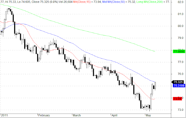
Dollar Fibonacci Retracement - 9-22-2011
79 looks like a good resistance line from now when looking at a 2 year chart:

It has been both support and resistance between 2010 and 2011! The next line is at around 80!

It has been both support and resistance between 2010 and 2011! The next line is at around 80!
Thursday, August 11, 2011
It has to be a new candlestick pattern...
Strange pattern in the S&P Futures over the last 4 days!

Not sure what to call that pattern!
Not sure what to call that pattern!
Tuesday, August 9, 2011
S&P Futures - These are big candles
Pretty amazing pattern in the S&P futures - matching black and white candles in consecutive days. And big ones at that! This does not happen in a rational market though!

We also happened to run almost exactly into a Fibonacci retracement yesterday (and crossed another one rather abruptly). There is a 50% retracement over our head at 1188 that served as confluence line back last November. Resistance level was more around 1200 though and it is of course a psychological line!


Click to enlarge
We also happened to run almost exactly into a Fibonacci retracement yesterday (and crossed another one rather abruptly). There is a 50% retracement over our head at 1188 that served as confluence line back last November. Resistance level was more around 1200 though and it is of course a psychological line!

Click to enlarge
Sunday, August 7, 2011
Oil 8/7/2011
Here are some quick charts for oil. First a retracement chart anchored on the lows of last May and the highs and May 2011 (interesting, exactly one year between lows and highs).

I have circled in green the congestion points around Fibonacci lines. On Friday we bounced off the 61.8% line (traditionally the best retracement target) at around $85. That line (not a retracement line then) had acted as support back in February!
Looking at the standard set of indicators (Stochastics (15.3), MACD (12,26), RSI (15) and OBV), we can see some positive signs as both the Stochastics and RSI made turns on Friday's price action.

As an aside, I circled in green where OBV punched through the support line on August 1 (pretty decisively actually) which was a giveaway that we should have expected a bad correction! The other indicators were pointing down already, but the volume action was very telling and confirmation!

Click to enlarge
I have circled in green the congestion points around Fibonacci lines. On Friday we bounced off the 61.8% line (traditionally the best retracement target) at around $85. That line (not a retracement line then) had acted as support back in February!
Looking at the standard set of indicators (Stochastics (15.3), MACD (12,26), RSI (15) and OBV), we can see some positive signs as both the Stochastics and RSI made turns on Friday's price action.

Click to enlarge
As an aside, I circled in green where OBV punched through the support line on August 1 (pretty decisively actually) which was a giveaway that we should have expected a bad correction! The other indicators were pointing down already, but the volume action was very telling and confirmation!
SPY - August 7, 2011
Here are some quick charts for SPY on this Sunday before what could be a very interesting Monday!
The first chart show the Fibonacci lines anchored on the lows of 2010 and highs of this year. We can see that on Friday we bounced off the 50% retracement line after a very shaky day. A correction to the 61.8% line (around 115) would actually make sense historically.

On the technical side, we have some positive signs and some scary negative ones. Below are charts for Stochastics (15,3), MACD (12,26), RSI (15) and OBV.

Stochastics are showing a bounce after Friday's action which reflects the fact that we finished way off the lows of the day. But the other indicators are not so optimistic. Clearly, MACD is usually lagging. But look how OBV cratered on Friday! We are at lows going back to July 2009 except that OBV was on the way up then, not down!
At the same time, we are clearly way oversold and indicators such as RSI are at level not seen since last July and we did bounce from there. But I could not predict a bottom here. This is looking very much like last May and June when we had a couple of big down days (4 days with over 3% losses including 2 over 4%) and then some rallies, but it took 4 attempts to make a bottom and we lost more than 15%... A similar loss would put us around 117.
[Update] - One more chart to illustrate where we are now:

The dotted parallel lines are a standard regression channel with a width of 1 Standard Error on each side. This covers 200 days. The red, blue and green lines are associated with a n-th order Polynomial fit (in this case 3rd order) with channels at 1 and 2 Standard Errors on each side. In both cases, we are way outside the channels which does not happen that often.
The first chart show the Fibonacci lines anchored on the lows of 2010 and highs of this year. We can see that on Friday we bounced off the 50% retracement line after a very shaky day. A correction to the 61.8% line (around 115) would actually make sense historically.

Click to enlarge
On the technical side, we have some positive signs and some scary negative ones. Below are charts for Stochastics (15,3), MACD (12,26), RSI (15) and OBV.

Click to enlarge
Stochastics are showing a bounce after Friday's action which reflects the fact that we finished way off the lows of the day. But the other indicators are not so optimistic. Clearly, MACD is usually lagging. But look how OBV cratered on Friday! We are at lows going back to July 2009 except that OBV was on the way up then, not down!
At the same time, we are clearly way oversold and indicators such as RSI are at level not seen since last July and we did bounce from there. But I could not predict a bottom here. This is looking very much like last May and June when we had a couple of big down days (4 days with over 3% losses including 2 over 4%) and then some rallies, but it took 4 attempts to make a bottom and we lost more than 15%... A similar loss would put us around 117.
[Update] - One more chart to illustrate where we are now:

Click to enlarge
The dotted parallel lines are a standard regression channel with a width of 1 Standard Error on each side. This covers 200 days. The red, blue and green lines are associated with a n-th order Polynomial fit (in this case 3rd order) with channels at 1 and 2 Standard Errors on each side. In both cases, we are way outside the channels which does not happen that often.
BAC in a freefall
I have read multiple articles related the current Bank of America troubles and looking at the chart, we see a scary looking future! Here are the links to the articles I refer to:
Bank of America Death Watch
Is Bank of America at Risk of a Death Spiral
Here is the latest chart of BAC with a Fibonacci retracement coming from the lows of 2009 to the highs of 2010. I have circled in red where the lines acted as resistance and support. Last week, we punched decisively through the 61.8% retracement. This could act as resistance ($9.28) should we experience a rally while the next line of support is at $6.31.
The stock is in technical hell, oversold in just about all the indicators, but amazingly enough, even with last week's huge move, it has not bottomed out in some indicators yet. This could indicate more pain to come!

I would certainly stay away from that stock while the legal and financial dust clear up!
Bank of America Death Watch
Is Bank of America at Risk of a Death Spiral
Here is the latest chart of BAC with a Fibonacci retracement coming from the lows of 2009 to the highs of 2010. I have circled in red where the lines acted as resistance and support. Last week, we punched decisively through the 61.8% retracement. This could act as resistance ($9.28) should we experience a rally while the next line of support is at $6.31.
The stock is in technical hell, oversold in just about all the indicators, but amazingly enough, even with last week's huge move, it has not bottomed out in some indicators yet. This could indicate more pain to come!

Click for a larger image
I would certainly stay away from that stock while the legal and financial dust clear up!
Thursday, August 4, 2011
Yes, we are oversold
Here is a daily chart of SPY with from top to bottom William %R, TRIX and RSI. I have circled in green the last lows for TRIX and RSI and these go back to last July! These indicators are not standard, they are adaptive and smoothed but the actual ones will show something similar!
So yes, we are currently oversold and the last time it was that bad, we bounced back 6% in 5 days. So there is hope! On the other hand, macro conditions are not exactly conducive to a big bounce!

So yes, we are currently oversold and the last time it was that bad, we bounced back 6% in 5 days. So there is hope! On the other hand, macro conditions are not exactly conducive to a big bounce!
Wednesday, July 20, 2011
XLF Charts
Here are some Fibonacci lines for XLF. There might be some tough slogging ahead...


Oil Retracements 7/20/2011
Here is a new oil chart based on the highs and lows of the year. There seems to be a good line around 99.32 that has acted as support and resistance for the last 2 months. There is apparently support around 90.50 on the down side!


Friday, June 24, 2011
Commitment of Traders - Oil 6/24
Here is an updated chart from Barchart on the commitment of traders:
 We took another step down from last week! Big money is leaving the trade...
Thursday, June 23, 2011
Dollar at Resistance
That 76.22 line has been support (green circle) and resistance (red circles) in the last 3 months or so. And yet again today, we are bumping against it. Until we go through decisively, we can't get too bullish.
That 200 dma is still going down as well...

That 200 dma is still going down as well...

Sunday, June 19, 2011
The Mysteries of Copper
Copper has been acting wildly over the next few months - victim to some financial shenanigans in China and an unclear picture of the real demand.

The technical picture is not brilliant! It is trading below the 200 dma (green line) and flirting with both the 15 and 50 dma (red and blue lines). Both are below the 200 dma which is an indication of weakness. I have drawn 2 more studies - a regression channel of 1 standard deviation with dating back to the lows of last June and some Fibonacci lines covering the same period. Copper has been hugging the bottom line of the regression channel (which is still pointing up) and trading between 2 Fibonacci lines at 3.91 and 4.19. The 200 dma is at 4.20 now so going through both lines will not be easy. But as with other commodities, the current political situation could change everything quickly.
As far as indicators are concerned, a lot of them are pointing up now as of last week! For what it's worth...
QQQ On the Brink
Talk about an ugly chart - look at the QQQ as of Friday!

All the signs point down - the index is below its 15 (small red line), 50 (blue line) and 200 dma (lime green line). In addition, both the 15 and 50 dma are now pointing down. I have a added a regression channel dating from the last lows of last July with width of 1 standard deviation and we broke below that for the first time last week! We closed below the lows for March. The next real support is around 52.68 where there is a fib line that was confirmed by some congestion back in November.
The problem with the QQQ is that there is no real leadership from the big guns - AAPL has been flat to down, CSCO is finding a bottom, INTC and MSFT are going nowhere. NFLX is not going to save the index!
On the lighter side, I have one double-smooth stochastic indicator pointing up as of Wednesday which could indicate a bottom (or temporary consolidation) which it has in the past. But it's sometimes too early and other indicators are pointing down! But geopolitic issues are weighing on the market now and it's not something that indicators will predict.

Friday, June 17, 2011
Oil - June 17
Not a pretty picture with oil at the end of today. Using the lows of February and Highs of last month as anchors for a Fibonnaci study, we can see that the 50% retracement line held for a while (large red circle), acting as support and resistance for close to a month with spikes to the 38% retracement line. But this week has been bad with both the 61.8% retracement line and the 200 DMA broken! The 50 DMA is no decidedly going down and above the 15 DMA.
 All my others indicators are now pointing down. The next support line is at 90.50, but it's weak. Real support is around 85 which is where the big money came in during the last rally. But anything is possible on a daily basis especially over a weekend!
The daily lines worked pretty well today again:


The daily lines worked pretty well today again:

It got pretty dicey in the afternoon when S3 was broken (first green circle) but the market recovered around 92.50 (there is a dail fib line there not pictured) and climbed back to S2 (second green circle) by the end of trading. It is not encouraging for the oil market that on a day when the dollar lost over 50 basis points that oil lost ground as well.
Wednesday, June 15, 2011
Follow the Big Money on Oil
Looking for an explanation for the oil move in the latest weeks - look no further than the big money leaving the station. Barchart (www.barchart.com) publishes a Commitment of Trader chart updated on a weekly basis. The latest one is below.
 The middle chart is the traditional Commitment of Trader (COT) chart. The green line is what is called Large Spec. These are large banks and money managers. The blue chart in the lower chart (Disaggregated COT) represent Managed Money (commodity traders or advisers). The charts plot the difference between long and short positions of the various groups. The higher the line, the "longer" one group is. Look what has been happening since early May - big money is getting out of oil. They have been driving the price up since last September and now, they are cashing in. And look at the price since then... Surprise!

The Value of Support and Resistance Lines
The move in oil today is the perfect illustration of why it is valuable to have an idea of where the price will "stick" in the coming hours. Drawing support and resistance line based on previous day prices is the easiest way. The formula for calculating the Pivot Point and the Support and Resistance line is available on the Internet. I have programmed Amibroker to display them automatically in my charts at the beginning of the day. Below is today's price action on the oil future market.

The Pivot Point for the day is in gray, the support lines in red. Resistance lines do not appear as they are above 100. The red circles point out congestion areas and support where you can tell that there was some hesitation on the direction. It is not always that clear cut, but these lines usually offer some guidance!

The Pivot Point for the day is in gray, the support lines in red. Resistance lines do not appear as they are above 100. The red circles point out congestion areas and support where you can tell that there was some hesitation on the direction. It is not always that clear cut, but these lines usually offer some guidance!
Friday, May 13, 2011
Dollar Fibonacci Retracement - 5-13-2011
And to match the euro Fibonacci retracement, here is the opposite chart with the dollar using the lows of October and the highs of January as anchors. The red dotted line is a regression channel for 2011 and we are against the top line now!


Euro charts 5-13-2011
Some euro charts to put the latest moves in perspective.
First a regression channel for 2011. We are now at the bottom of the channel which should provide some support.

And now for some Fibonacci lines - using the 2001 low and highs as anchors. As with the regression channel, 1.41 seems to be a good support level. At least temporarily.

And finally, a Fibonacci regression using the previous highs of last October and the lows of January as anchors. Once again, the 1.41 line is significant.

Monday, May 9, 2011
Dollar reaches 50 dma!
The dollar is not at its 50 dma which has been breached last in January! Might be a good resistance point...

Friday, April 29, 2011
Copper - Regression Channel 4/29/2011
Copper is getting close to the lower limit of the regression channel it has been in since last June!


Wednesday, April 6, 2011
Silver - Resistance Line?
Here is an updated chart with the Fibonacci retracement. This is the same chart I posted yesterday and as predicted, silver is hedging closer to $40. The $39.60 Fibonacci line is holding for the moment, but weakness in the dollar should propel silver over that bar eventually.

Tuesday, April 5, 2011
Silver - Regression and Retracement
And here is a quick chart for silver

Quite the parabolic move for silver. Same overlay as the gold chart - regression channel with a standard deviation of 1 and a Fibonacci retracement from the lows of August to December and January! Silver has had a much better run than gold in the that timespan. There was some hesitation around the 50% line, but it has been a runaway train since then. Looks like the $40.00 line could be a target.

Click for a larger image
Quite the parabolic move for silver. Same overlay as the gold chart - regression channel with a standard deviation of 1 and a Fibonacci retracement from the lows of August to December and January! Silver has had a much better run than gold in the that timespan. There was some hesitation around the 50% line, but it has been a runaway train since then. Looks like the $40.00 line could be a target.
Gold - Regression and Retracement
A quick chart of gold to try guessing were we are going.

The parallel lines are a regression channel using a standard deviation of 1. The Fibonacci retracement originates at the lows of last August and retraces from the highs of December to the lows of January. All the retracement lines have acted as resistance and support since then. The regression channel and Fibonacci lines all point out to a 1447 resistance line that has held since early March.

Click for a larger picture
The parallel lines are a regression channel using a standard deviation of 1. The Fibonacci retracement originates at the lows of last August and retraces from the highs of December to the lows of January. All the retracement lines have acted as resistance and support since then. The regression channel and Fibonacci lines all point out to a 1447 resistance line that has held since early March.
Monday, April 4, 2011
Valuation - Aerospace Industry
This is the first of many posts about the valuations calculated by my method. I will post one industry at a time to make for better comparison. Obviously every company will have its own set of problems, but overall, ratios should be somewhat constant over an industry.
First in line is the Aerospace industry - it's first alphabetically...

Notable on this list are the big guys - BA, GD and LMT. 3 big defense contractors. All 3 are rated as cheap in general, but most specifically compared to sales and growth which are the most important factors. BA is close to a fair valuation in this estimate - the average being around $79 and it traded at $74 on Friday. Obviously the growth number is based on estimates so it is only as reliable as the estimates.
Also apparently undervalued are NOC, LLL and RTN. These 3 are undervalued on all criteria - sales, book and growth which would usually get you a spot in my combination screen when combined with some momentum.
Others like FLIR, GR and ERJ are currently expensive - between 11 and 31%. GR and FLIR are cheap relative to potential growth but expensive relative to book and sales. The closest valuation is GR. ERJ is really expensive relative to growth and cheap relative to sales.
Overall, a mixed bag!
First in line is the Aerospace industry - it's first alphabetically...
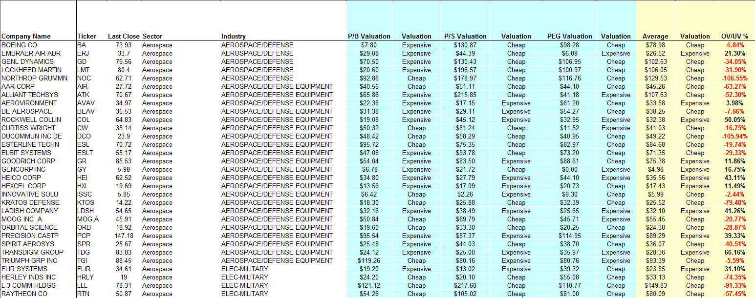
Click on the picture for a larger view.
Notable on this list are the big guys - BA, GD and LMT. 3 big defense contractors. All 3 are rated as cheap in general, but most specifically compared to sales and growth which are the most important factors. BA is close to a fair valuation in this estimate - the average being around $79 and it traded at $74 on Friday. Obviously the growth number is based on estimates so it is only as reliable as the estimates.
Also apparently undervalued are NOC, LLL and RTN. These 3 are undervalued on all criteria - sales, book and growth which would usually get you a spot in my combination screen when combined with some momentum.
Others like FLIR, GR and ERJ are currently expensive - between 11 and 31%. GR and FLIR are cheap relative to potential growth but expensive relative to book and sales. The closest valuation is GR. ERJ is really expensive relative to growth and cheap relative to sales.
Overall, a mixed bag!
Why is Oil going higher
Barchart.com has some neat charts and one of the most instructive is their Commitment of Traders chart. For example, looking at the Oil COT, we can see that over the past months, there has been a rush of managed money into the oil market fueling that rise in prices. Even retail investors are getting into the act as producers and swap dealers start getting out!
 This bears watching as prices should start dropping as soon as managed money starts leaving!

Sunday, April 3, 2011
Is this move for real? Part 2
I wanted to follow up on that post with updated charts. Since the last charts, some averages have caught up while one in particular has opened up a wide gap - DIA. It is safe to say that for that index, the last week's move looks a little fake as it was not confirmed by volume. Volume on the other hand seems to confirm the IWM move! We'll see how that pans out over the next couple of days!


DIA
SPY
QQQ
IWM
Valuation Spreadsheet - 4/3/2011
I have updated my valuation spreadsheet online. It can be viewed at the following link.
More information on the valuation criteria can be found here.
I have added closed to 1000 tickers to the list. It should now contain all the optionable stocks in the US markets. There might be some errors as the data source is not always up to date in that regard! There are also some holes in the valuation in particular to the ones that relate to growth as some companies don't have enough analyst's predictions for an accurate number. This will generally results in a valuation of $0.00. This is not ideal, but I have to work with the data provided.
In addition, I have tried to rank the stocks using my valuation, some momentum criteria and other more proprietary values. The Top 10 in that list are:

The Average column list the average valuation between the book, sales and growth valuation. All these stocks are currently undervalued in this model. I'll track these over the next couple of weeks and see what kind of results I get!
More information on the valuation criteria can be found here.
I have added closed to 1000 tickers to the list. It should now contain all the optionable stocks in the US markets. There might be some errors as the data source is not always up to date in that regard! There are also some holes in the valuation in particular to the ones that relate to growth as some companies don't have enough analyst's predictions for an accurate number. This will generally results in a valuation of $0.00. This is not ideal, but I have to work with the data provided.
In addition, I have tried to rank the stocks using my valuation, some momentum criteria and other more proprietary values. The Top 10 in that list are:
The Average column list the average valuation between the book, sales and growth valuation. All these stocks are currently undervalued in this model. I'll track these over the next couple of weeks and see what kind of results I get!
Combination Screen - 4/1/2011 Results
Another good week for the combination screen. The 10 stocks beat the broader market index by 0.4% gaining 1.8% for the week. After 9 weeks, the portfolio is up almost 11.50%, beating the S&P500 3 to 1. I have to admit that I am surprised by the results, but the market has been very helpful to bullish bets!

I have updated the old weekly picks but I will now treat them as long time experiment to see how long an effect the criteria have.
For example, the original 10 stocks picked on 1/31/2011 are still up strong after 9 weeks! Not doing quite as well as the portfolio that I rebalance every 4 weeks, but still beating the market by a wide margin.

I'll post results for all the screens later this week. But so far, not one of the weekly list is trailing the broader market average. This seems to validate the criteria. But more testing is still needed.
The candidates for this week's list are:

As usual, I will select only the top 10 as ranked by price-to-sales for my weekly list.

I have updated the old weekly picks but I will now treat them as long time experiment to see how long an effect the criteria have.
For example, the original 10 stocks picked on 1/31/2011 are still up strong after 9 weeks! Not doing quite as well as the portfolio that I rebalance every 4 weeks, but still beating the market by a wide margin.
I'll post results for all the screens later this week. But so far, not one of the weekly list is trailing the broader market average. This seems to validate the criteria. But more testing is still needed.
The candidates for this week's list are:
As usual, I will select only the top 10 as ranked by price-to-sales for my weekly list.
Subscribe to:
Posts (Atom)